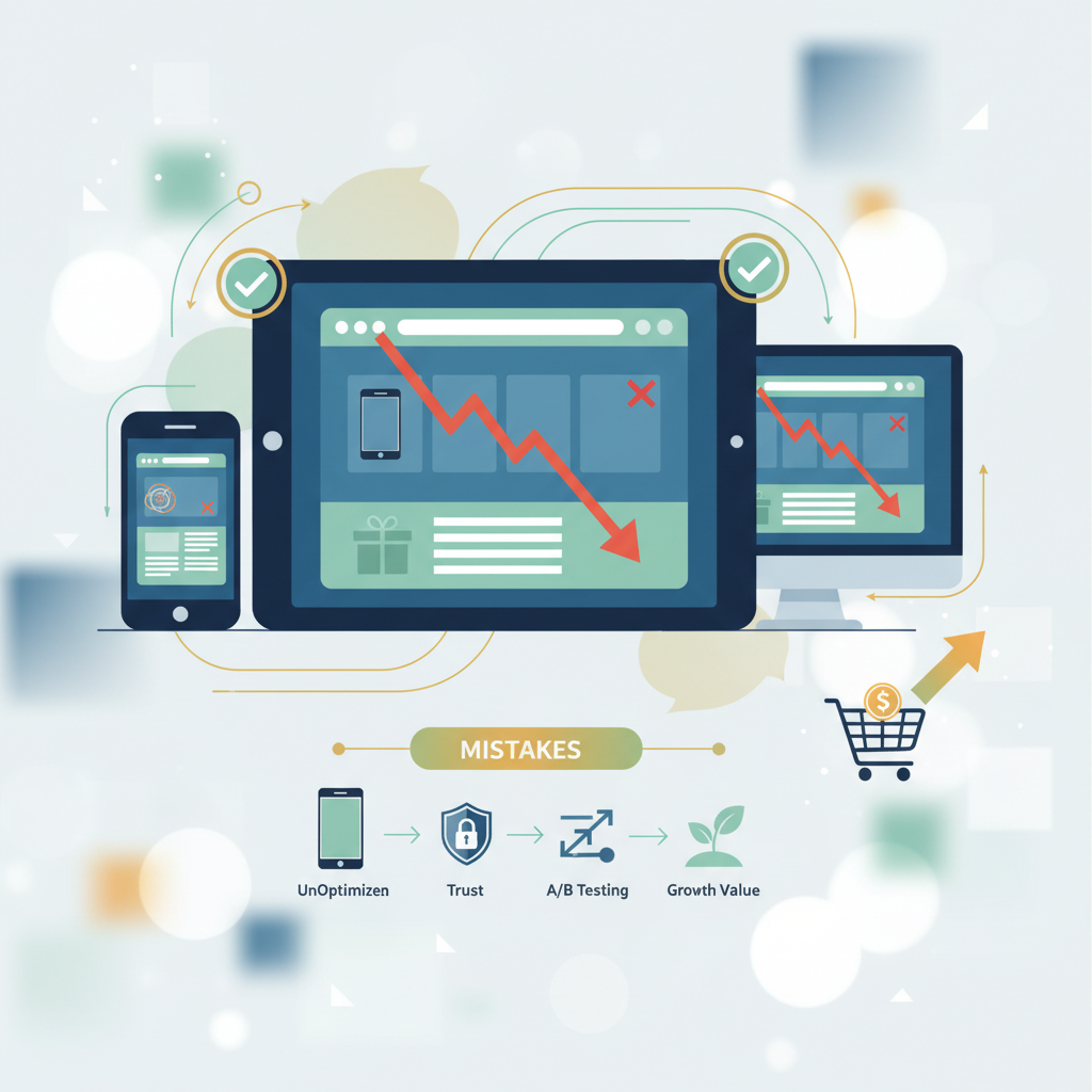
5 Landing Page Mistakes That Cost eCommerce Managers Conversions (And How to Fix Them)
5 Landing Page Mistakes That Cost eCommerce Managers Conversions (And How to Fix Them)
Are your landing pages converting visitors into customers? They should be! Landing pages are the digital storefronts of your online business, and they're where potential customers first encounter your brand. A well-crafted landing page can make or break your sales. But even the savviest eCommerce managers make mistakes that hurt conversions. This guide will explore five common pitfalls and provide actionable solutions to optimize your landing pages for maximum impact.
Why These Mistakes Matter
In the cutthroat world of eCommerce, every click counts. Failing to optimize your landing pages can lead to significant losses. Think about the wasted ad spend, the lost opportunities, and the impact on your bottom line. Let's be honest—the average conversion rate for eCommerce websites is low, hovering around 2-3%. That means a vast majority of visitors aren't converting. Identifying and correcting landing page mistakes is crucial for improving these numbers and increasing revenue.
Several factors contribute to landing page effectiveness, including design, copy, user experience, and technical performance. Each element matters in guiding visitors toward a conversion. When these elements are poorly executed, they create friction, confusion, and ultimately, a high bounce rate. The goal is to create a seamless, persuasive experience that encourages visitors to take the desired action.
Mistake #1: Ignoring Mobile Optimization
Ignoring mobile optimization is a cardinal sin. With a significant portion of web traffic coming from mobile devices, a non-responsive or poorly optimized landing page can alienate a large segment of your audience.
The Problem: A desktop-focused landing page will likely appear distorted, slow to load, and difficult to navigate on a mobile device. This leads to a frustrating user experience, and visitors will quickly abandon the page.
The Stats: Mobile devices account for approximately 59% of all web traffic worldwide Statista. Furthermore, 40% of users will abandon a website if it takes longer than 3 seconds to load Neil Patel.
The Fix: Ensure your landing pages are fully responsive and adapt seamlessly to different screen sizes. Use a mobile-first design approach, prioritizing content and functionality for smaller screens. Test your pages on various devices and browsers to ensure a consistent experience. Optimize images and use techniques like lazy loading to improve page speed.
Pro Tip: Use Google's Mobile-Friendly Test (https://search.google.com/test/mobile-friendly) to quickly assess your landing pages' mobile-friendliness.
Mistake #2: Cluttered Design and Poor User Experience (UX)
Overcrowding your landing page with too much information, irrelevant visuals, and distracting elements is a surefire way to confuse visitors and hurt conversions. A cluttered design overwhelms users, making it difficult to understand the core message and take the desired action.
The Problem: Visitors need a clear and concise path to conversion. A cluttered page makes it difficult for them to find what they're looking for, leading to frustration and abandonment. Poor UX includes things like confusing navigation, unclear calls to action (CTAs), and slow loading times.
The Stats: According to research, a website visitor forms an opinion within 0.05 seconds Missouri University of Science and Technology. A well-designed website can improve conversion rates by up to 200% Forrester Research.
The Fix: Embrace minimalism. Focus on a clear and concise message, using whitespace effectively to guide the eye. Use a logical visual hierarchy, highlighting the most important information. Simplify navigation and ensure your CTA is prominent and compelling. Test different designs and layouts to optimize the user experience.
- Prioritize Visual Hierarchy: Use larger fonts and colors to draw attention to key elements.
- Optimize for Speed: Compress images and leverage browser caching.
- Conduct User Testing: Get feedback on the design and usability from real users.
Mistake #3: Weak or Unclear Value Proposition
Your value proposition is the promise you make to your customers. It's the reason they should choose your product or service over the competition. If your value proposition is weak, unclear, or fails to resonate with your target audience, visitors will have no motivation to convert.
The Problem: A weak value proposition doesn't clearly communicate the benefits of your offer. It leaves visitors unsure of what they're getting and why they should care. This lack of clarity leads to skepticism and inaction.
The Stats: Research indicates that 70% of visitors will leave a website if they don't understand the value proposition within the first 10 seconds ConversionXL.
The Fix: Clearly articulate the benefits of your product or service. Focus on how it solves your customers' problems or fulfills their needs. Use compelling language and avoid jargon. Highlight what makes your offer unique and better than the competition. Make sure your value proposition is prominent and easy to understand.
Pro Tip: Use customer testimonials and social proof to reinforce your value proposition and build trust.
Mistake #4: Ignoring A/B Testing
Without A/B testing, you're essentially guessing what works. A/B testing allows you to compare different versions of your landing pages and identify which elements drive the best results. Ignoring this practice means you're missing out on valuable opportunities to optimize and improve conversion rates.
The Problem: Without data-driven insights, you're relying on assumptions and gut feelings. This can lead to wasted resources and missed opportunities to optimize your pages for maximum effectiveness.
The Stats: Businesses that A/B test see an average conversion rate increase of 10-20% VWO.
The Fix: Implement a robust A/B testing program. Test different headlines, CTAs, images, and layouts. Analyze the results and use the data to inform your design and content decisions. Continuously test and refine your landing pages to maximize their performance.
- Test One Element at a Time: Isolate variables for accurate results.
- Use a Dedicated A/B Testing Tool: Google Optimize or VWO are good options.
- Analyze the Results: Don't just look at the numbers; understand why a variation performed better.
Mistake #5: Lack of Trust Signals
Without trust, visitors are hesitant to share their information or make a purchase. Trust signals are elements that build credibility and reassure visitors that your website is legitimate and trustworthy. The lack of these signals can significantly decrease conversions.
The Problem: Without trust signals, visitors may perceive your website as untrustworthy or unprofessional. This can lead to a lack of confidence and ultimately, a lower conversion rate.
The Stats: 75% of consumers judge a company’s credibility based on its website design Stanford Persuasive Technology Lab. Adding trust badges can increase conversions by up to 42% Baymard Institute.
The Fix: Include trust badges, customer testimonials, security seals, and contact information. Ensure your website has a professional design and clear contact information. Make it easy for visitors to contact you and resolve any concerns. Build trust by showcasing social proof, such as customer reviews, case studies, and media mentions.
| Feature | Description | Impact on Conversions |
|---|---|---|
| Trust Badges | Displaying security certifications, payment logos, and third-party endorsements. | Increases confidence in the security of transactions, leading to higher conversion rates. |
| Customer Reviews | Showcasing positive feedback from previous customers. | Builds social proof and demonstrates the value of your product or service, encouraging visitors to convert. |
| Contact Information | Providing clear and accessible ways for visitors to reach you, such as a phone number, email address, or live chat. | Instills confidence and reassures visitors that they can easily get help if needed, leading to increased trust and conversions. |
Prevention Checklist
To avoid these landing page mistakes and optimize your conversion rates, implement the following checklist:
- Mobile-First Design: Ensure your landing pages are fully responsive and optimized for mobile devices.
- Clear and Concise Design: Use a clean, uncluttered design with a clear visual hierarchy.
- Compelling Value Proposition: Clearly communicate the benefits of your product or service.
- A/B Testing: Continuously test different elements of your landing pages to identify what works best.
- Trust Signals: Include trust badges, customer testimonials, and contact information to build credibility.
- Fast Loading Speed: Optimize images and code to ensure fast loading times.
- Strong CTAs: Use clear and compelling calls to action that encourage conversions.
By addressing these common landing page mistakes, eCommerce managers can significantly improve their conversion rates and drive more revenue. Remember that continuous testing and optimization are key to success. Embrace data-driven decisions and make it a priority to provide a seamless and persuasive experience for your visitors.
Actionable Takeaways:
- Audit Your Landing Pages: Use the checklist above to evaluate your current landing pages and identify areas for improvement.
- Prioritize Mobile Optimization: Ensure your landing pages are fully responsive and optimized for mobile devices.
- Implement A/B Testing: Start testing different elements of your landing pages to optimize for conversions.
- Focus on the User Experience: Ensure your landing pages are easy to navigate, visually appealing, and provide a clear value proposition.
- Build Trust: Include trust signals to build credibility and reassure visitors.
By implementing these strategies, you can transform your landing pages into powerful conversion engines. Good luck!